A couple of years ago my good friend, the writer Sara Ryan, did the world a favor when she put together a blog post series called “How NOT to Write Comics.” (Post one, post two, post three.) It’s a useful collection of tips and anecdotes to help aspiring comic book writers, with most of the information drawn (haha) directly from comics artists who have suffered at the hands of inexperienced or incompetent writer-collaborators.
These posts were needed in part because comic books are still not a very dominant medium in the English-speaking world. Travel to France or Japan and you’ll witness a very different culture, where plenty of cartoonists rank in the creative elite, producing work that is both widely read and taken seriously by critics and scholars.
Yet many people in my part of the world still don’t really know how to read comics, much less create them. Sara’s posts provided a useful sort of “Goofus and Gallant” appendix to the ever-growing body literature on how to create compelling and readable graphic narratives.
However, one group wasn’t served by “How Not To Write Comics,” because this group is not interested in writing comics per se. They are interested in writing about comics – or their editors are forcing them to try. Because now that comics have infiltrated the mainstream book trade (and the reading lists of grownups) in the form of graphic novels, memoirs, and trade collections, an increasing number of critics are faced with the task of reviewing the damn things.
The results are, shall we say, mixed.
For every column inch of well-considered and well-informed discussion, there are fifteen yards of lazy, confused, condescending, clueless, unhelpful, and sometimes even frankly hostile copy.
Some of these critics are just jerks who resent that their editor has torn the galley copy of the latest Houellebecq novel out of their hands and replaced it with some stupid book with pictures in it. Pictures. Only Umberto Eco gets to use pictures!
I can’t help those people. I just feel bad for them, because they’re going to miss out on a lot of wonderful and important books.
This leaves all the critics who are just beginning their journey into comics reading, or who have yet to be entirely won over to the medium but want to keep an open mind (perhaps due to peer pressure: I remember a literati cocktail party where somebody near me anxiously muttered “I guess we’re all supposed to read graphic novels now.”) These brave souls are willing to give it a try, but they tend to make a lot of mistakes when they first start out.
Certain errors needlessly recur in comics criticism. Encountering one of them in a critical review or essay is an instant signal to an informed comics reader that the writer doesn’t know what they’re talking about. There might still be some excellent insights on display, but those insights are diminished by sharing the page with outright errors.
Don’t get me wrong: there is plenty of room for interesting-but-still-arguable observations from outsiders, and even room for points best described as obviously-not-true-if-you-know-your-stuff–but-shows-genuine-effort. I don’t want to discourage original thought. But the sorts of mistakes I’m after in this post are not near-misses born from attempts to take on something new. They’re just unprofessional blunders.
Luckily, these mistakes are easily avoided with a little attention. This post is intended to help you, the critic, identify those mistakes in advance so they never hit the page. So, without further ado…I present to you my own personal….
This is the second of two new pages in two weeks. It’s good to be back!
I spent most of my summer putting together the three new books I’ll be selling this fall – all in different sizes, bindings, and colors. I did virtually all of the print design and set-up myself – an arduous though always educational task, composed of 10% fun design choices, 85% eyeball-nuking detail work and frantic technical fixes, and 5% waiting for InDesign to finish saving.
My proofs arrived from the printer this week (and they look amazing), so there’s light at the end of the tunnel, but all that work did cut into my usual creative time-budget and gave me a sore arm for a few weeks.
Nonetheless I managed to have a bit of fun on the side! Here’s a sampler of some of the pieces that I snuck onto my drawing table this summer. (Did I also mention that I got to play a Vulcan in a stage production of a Star Trek episode? No? That happened, too.)
Lotsa foxes! Drawn for the Hero Initiative charity auction.
For the Portland Mercury, one of three different proposed social media apps that I think we could all actually use. I interviewed a performance artist whose work focuses on the internet, and accompanied it with some graphics of my own invention. I’ve also gotten to write a few straight-up theater reviews, which has been hugely fun.
For Jon Morris’ super-fun Official Handbook of the Marvel Universe : REDUXE project! In which artists re-draw and re-design entries from the old Marvel encyclopedia. I’ve always had a soft spot for Rogue (of the X-Men); I turned her into a bit of a surly gutter punk, which is always my mental image of her. It was fun to do very simple flat colors under a fairly realistic drawing style, a combination I don’t often try.
I have more saved up, but I’ll give myself a few weeks to reacquaint myself with the drafting table before I unleash it all. I hope my fellow Northern hemisphere dwellers had a lovely summer!
It’s been a very busy month since the fundraising portion of the Dylan Meconis Library 2012 project closed on Kickstarter. We closed with a fantastic $36,444 from 808 backers.
Pre-press work for all three books is right on track! Setting up three books in three formats, printed and bound three different ways (make that four, if you count the Bite Me hardcover) is no small task, so I’ve been hard at work in Adobe Photoshop and InDesign, prepping images and laying out pages (over 250 of them).
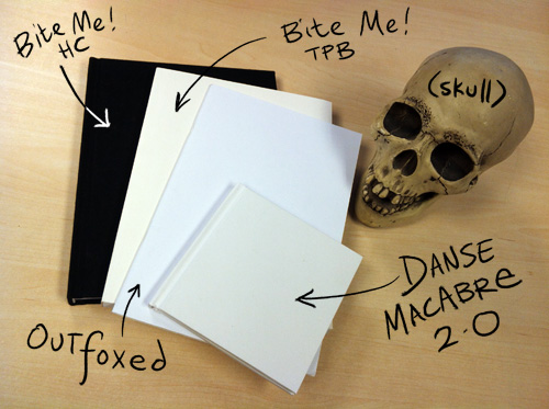
Exciting for all of the books is the arrival of the press dummies!

These are unprinted-on but fully constructed versions of the assembled books in their actual materials (minus dust-jackets on the hardcovers). This allows me to check that the dimensions are correct, see how much each book will weigh (important for shipping!), and make any changes to pagecount or paper stock! Also it allows me to freak out because the books are totally going to be real.
Allow me to say: they look and feel amazing. The Bite Me paperback has three-inch french flaps (!!); the hardcover has a really stunning, soft cloth binding that will be foil-stamped. Outfoxed will be printed on beautiful toothy parchment-colored paper. AndDanse Macabre 2.0 is one of the cutest bitsy little hardcovers I’ve ever held.
Murray the skull agrees.

As for the actual content of the books…
…is the easiest of the three projects, and has been basically print-ready for awhile now! All I’ve had to do is add a few incidental illustrations and adjust the technical settings of the book to fit the needs of my printer. I can’t wait to see the book in print, especially on that fantastic vanilla-toned paper!
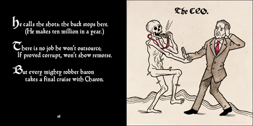
…has been piles of fun. Finalizing the written content (both silly poems and some explanatory text), tweaking type design, adjusting my images to look less like they were scanned a few months ago and more like they were found under some flagstones in a German monastery, etc.
Here’s an wee bitty preview image of the final layout and design for one of the early spreads in the book, the CEO!

I’ve also applied for permission from the University of Heidelberg to license images from the original 1488 Totentanz, with some language help from my super-talented German-speaking colleague Sarah Burrini (check out her fantastic work in English at http://sarahburrini.com/en/). It won’t be cheap, but that money will support the incredible research institution that brought the Totentanz to a digital audience in the first place, and give me a chance to expose even more readers to some of the originals.
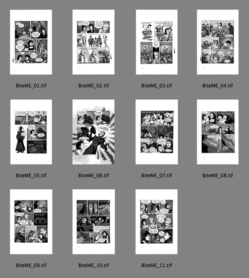
…is by far the most labor-intensive of the books! Here are all eleven pages of the newstory in Bite Me, patiently waiting in Adobe Bridge for to import them into the layout of the book – which I did just a few minutes later.

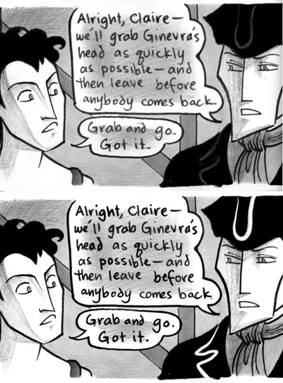
I’m also finishing up image quality touch-ups on the original book. This means everything from fixing flaws in the scans to removing smudges and cleaning up lettering or washed-out line work. Here’s a side-by-side example of some of this work in action! The top image is the original scan (which appeared in previous print editions) and the bottom is the new version of the image:

The changes may be subtle at a casual glance (cleaner/darker type and linework, less smudging, and you can finally see the lines of Lucien’s outfit) but these tweaks make a major difference over the course of 155 pages. Keeping the spontaneous, sometimes messy character of the original art but buffing it up to peak condition is something I haven’t had the time or money to really aim for in past printings. I’m confident that this is going to be the definitive edition.
Meanwhile, to give my hand a break from work-induced tendonitis, I’ve been moonlighting as Sarek’s aide in the Vulcan Diplomatic Corps at this year’s Trek in the Park. Sarek and Amanda are played by my lovely studiomates Paul Guinan and Anina Bennett. That’s me down way down on the left, wearing an EXTREMELY logical miniskirt and cloak combo.
Live long and prosper, y’all.